Flywheel.ag

The Story Behind a Visual Identity Built Around Trust

Overview

In agriculture, trust moves at the speed of a handshake: growers trust their co-ops, and co-ops trust their advisors. When that trust breaks down, the cost isn’t just a lost sale. It’s a damaged relationship built over years. Flywheel.ag is a software platform built to protect those relationships.

Designed for farmer co-ops and ag retailers, Flywheel brings crop planning, sales insights, and operational visibility into one system, giving every team member the right information at the right time. As the company grew, their brand wasn’t keeping pace with the quality of the product behind it. That’s where Strategie came in.

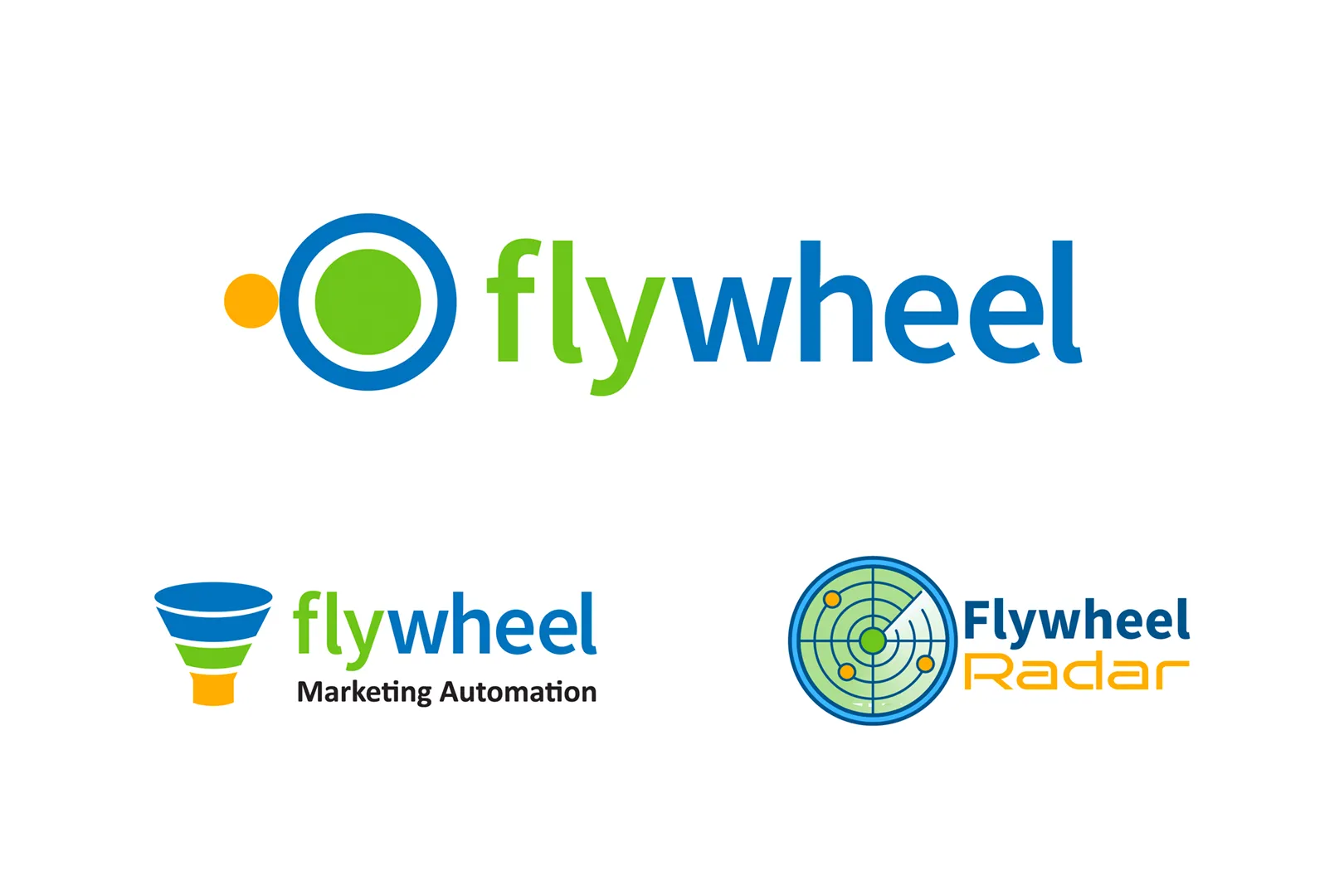
Flywheel came to Strategie with a clear challenge: a major brand cleanup. With nearly 30 brand colors, logos that felt disconnected from one another, and two distinct products, Flywheel Marketing and Flywheel Radar, their visual identity had grown fragmented over time. For a platform built around clarity and consistency, the brand was telling a different story. The goal was more than a visual cleanup. Strategie needed to build Flywheel a brand identity that matched the product’s credibility.
Process

In order to develop branding that accurately reflected Flywheel, Strategie prioritized planning over design. Before selecting any colors or logos, we aimed to understand who Flywheel is trying to reach, what interests those decision-makers, and what makes Flywheel uniquely valuable.

Together, we determined the target audience is practical, experienced professionals. They’re not looking for flash, opting for clarity and confidence instead. To reach them, Flywheel needs a brand that signals expertise, consistency, and reliability before a salesperson ever picks up the phone.

From there, we built a brand strategy around a simple principle: Flywheel’s identity should feel as organized and trustworthy as the software itself. With a clear strategic foundation in place, we moved into creative work, making deliberate decisions about what to keep, what to simplify, and what to unify.

Execution

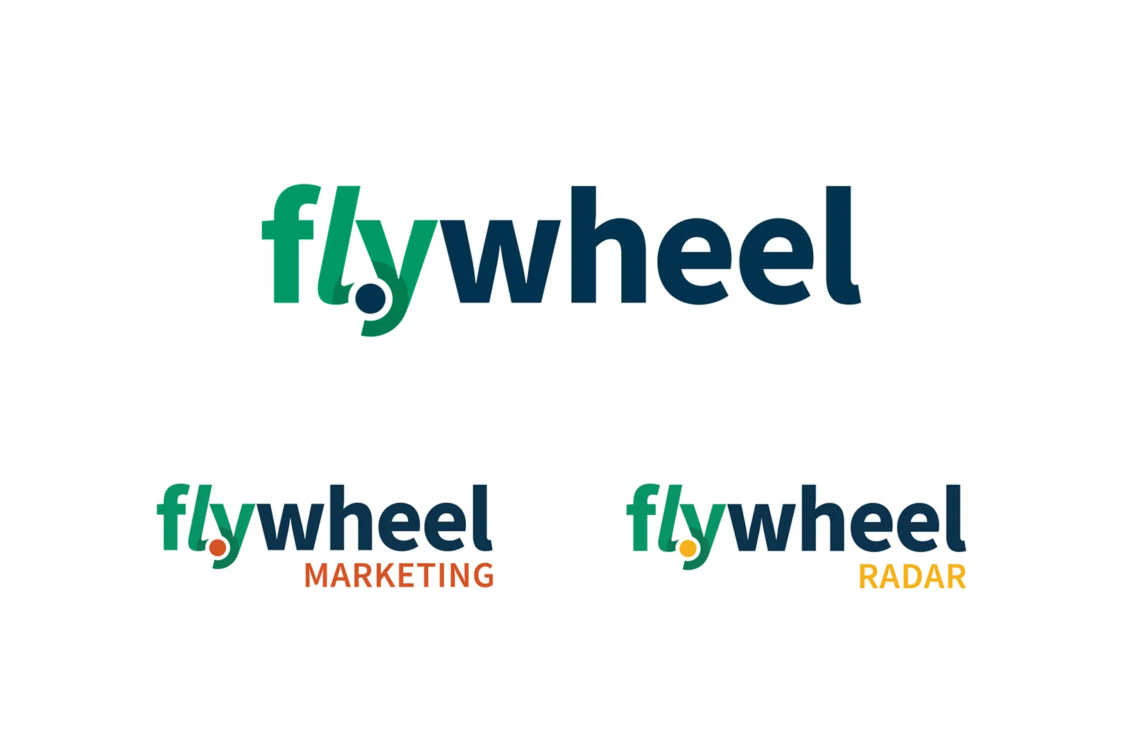
The crucial first step was to bring clarity to the brand structure as a whole. Strategie established a straightforward brand architecture: Flywheel as the parent brand, with Flywheel Marketing and Flywheel Radar as distinct but visibly related subbrands. It was important that we struck a balance between implementing design consistency to indicate they belong together and defining a distinct separation between the two subbrands.

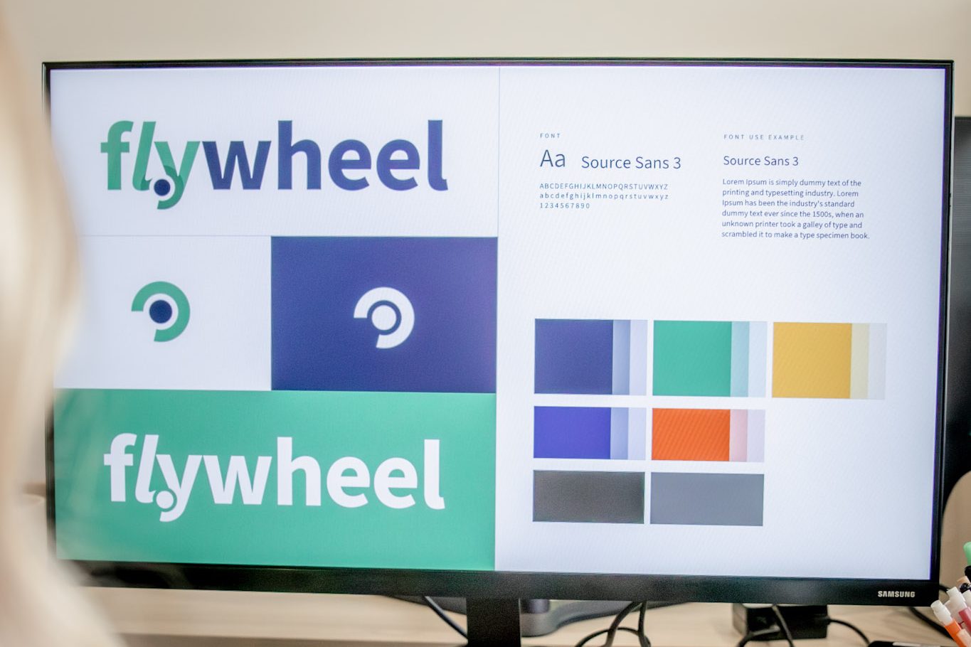
When it comes to the design changes themselves, the logo received the same treatment. Rather than maintaining two separate pieces that felt unrelated, we integrated the icon directly into the wordmark, so it reads as one cohesive unit at any size. We also reduced nearly 30 colors down to 7, retaining those with the most brand equity and building a palette that works consistently across every format, from a trade show banner to an email footer. As for the font the Flywheel team loved, we kept it. Part of effective brand work is identifying what works and can stay the same.

With the refreshed identity in hand, we developed a coordinated marketing strategy to support Flywheel. The campaign included a targeted email sequence to reach prospects, a direct mail flyer deployed to a curated list of co-ops and ag retailers, and a dedicated landing page built to convert interest into demo requests. These tactics were designed to create multiple touchpoints with the same prospect, building familiarity and credibility long before a sales conversation begins.

Results

The refreshed brand launched across Flywheel’s full spring 2026 marketing push, with every touchpoint — email outreach, direct mail, trade show presence, and a targeted landing page — reflecting a single, cohesive identity for the first time. Now, the brand has a sleek new look and a newly established sense of consistency and professionalism that matches the quality of the product behind it.